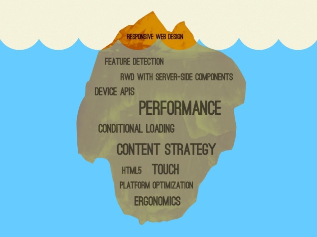
Responsive web design is becoming more clearly an important specification from our customers. Allthough the customer is mostly already satisfied when we port the same UI to different devices, responsive web design is just the top of the iceberg when we talk about optimizing web enabled Notes applications for different devices.
Today I followed a presentation from Brad Frost held at the Smashing conference 2012. You can find the slides also on Slideshare.
After the presentation I checked a couple of our corporate sites that are responsive with Akamai’s Mobitest and yes, they are responsive but the builders seem to have just looked at what’s sticking out of the water.
Reflecting this back to our development templates for Notes client, Web browser and Mobile device I can conclude we made some basic mistakes. Yes, the application layout control from the extension library may help you provide quickly a UI for desktop clients but this is not the web.
Why did IBM did not come up with a responsive application layout control and added responsive utility classes in OneUI? Or should we dissect the OneUI again like Declan Lynch did and solve it with SSJS?
Back to the drawing board that is for sure…


I too have asked the question as to why IBM did not provide any responsive capability in the OneUI. Even if you wrap it with something like Twitter Bootstrap it seems to override that styling in some places (i.e. formTable, formRow, formColumn). It seems that this may be caused by the order of which the stylesheets are loaded for OneUI, which we may be able to override. But still the frustration remains which makes you have to choose to have your own implementation, use something other than OneUI or put up with the un-responsiveness of OneUI.
How far do you think we can come with adaptive web design in XPages? We can detect user-agents but how about media queries? http://www.huffingtonpost.com/garrett-goodman/adaptive-design_b_2344569.html
I think it depends on how far someone is willing to go. I’ve recently started using Twitter Bootstrap quite a bit. It’s totally responsive, creates nice web pages and really aren’t that hard to incorporate into XPages. Bootstrap is dependent upon media queries (though I don’t totally understand them yet, mainly where to use them), so I think they certainly have their place.
But back to how far we can come with adaptive design… we could certainly do an open source project to make our own formTable elements as it seems that’s the biggest culprit when it comes to un-responsiveness because it creates an html table. But I’m afraid that the complexity of figuring out styles, widths and needed resources (i.e. jQuery, Bootstrap, etc) would make the effort not worth the return.
I also believed they once said to have ‘mobile first’ in mind… mobile is not Web in their minds?
Anyone who will write the CSS that makes the oneUI totally responsive would be my hero of the day !